Graphing Motion
Graphing Position
Understanding motion is greatly helped by graphing the position of the object as a function of time, and also the object's velocity as a function of time. Let's start with graphing the position first.
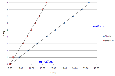
As an example, we took a toy motorized car, and set it rolling along a nine-meter-long track, our x-axis. When released from the starting line, the stopwatch was started, and the time that it crossed each subsequent meter was recorded. This process was then repeated with another, smaller toy car. Here is the resulting graph of position, x, as a function of time, t. (Click it if you'd like a larger version.)
The vertical axis is the position of the car, x, measured in meters. The horizontal axis is time, in seconds. Both cars traveled 9 meters, but the small car did it in less time (about 17 sec) than the big car (about 36 sec). The small car was the faster of the two, and this is reflected in the steepness of the line.
The data points do not form a perfectly straight line, because (1) perhaps the car did not maintain a perfectly constant speed, or (2) even if the car had a constant speed, the measurements may have slight errors. Notice the black lines that run through the cars' data points on the graph. They don't go exactly through all the data points themselves; instead, they are called best-fit lines, and represent the trend of the numbers. Looking at one best-fit line, you will see that some of the data points are above it and some below, but it is the straight line that is as close as possible to all the data points. The best-fit line represents our best estimete of what the graph would look like if the cars did travel at a constant speed, and if our measurements were perfect.
How steep the line is is called the slope, usually defined as
Here is the graph again, with the rise and run of the big car's best-fit line marked. (Again, click it if you want to see a larger version.)

The rise is the change in the location of the car, the distance it traveled, d=8.9 m. (Notice we are using the best-fit line, not the last data point.) The run is the time interval, 37 sec. The slope is, therefore,
The slope of a position-vs-time graph is the velocity. In this case, 8.9m/37sec = 0.24 m/sec.
Graphing Velocity
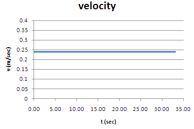
Now, let's graph the velocity of the big car. Its velocity is the slope of the position graph, and all those data points lie, with very good precision, on a straight line. The slope (steepness) of that line is the same during the entire trip, so the car's velocity is constant during that time. Here's a graph:

The car's speed was 0.24 m/sec.
Let's say we wanted to know how far the car moves in 25 seconds. You would do this calculation:
![]()
Look at the postion graph, and you will see at t=6.0 sec that x=6 meters. Hey, this stuff works!
Here's something even cooler, though!
Look at the v(t) graph. I've got it again below, with a rectangle marking the time from the start to 25 seconds. What is the height of this rectangle? It's the velocity, 0.24 m/sec. What is the width of the rectangle? The time, 25 seconds. What is height times width for a rectangle? The area!
The "area" under the graph of v(t) gives the distance the object travels.
Additional Practice & Activities
1. Sketch the distance-vs-time and velocity-vs-time graph for a car that starts at rest (like at a stoplight) and then speeds up to 40 miles/hr, then travels at a constant 40 miles/hr.
2. Sketch the distance-vs-time and velocity-vs-time graph for a car that is traveling at 60 miles/hr, then slams on the brakes, slowing down to 20 miles/hr. While it is still slowing down, it hits a tree and comes to a very sudden stop.
3. On Earth, if an object is heavy enough that air resistance is not significant, it will fall with a constant acceleration. That means that if you drop it, it gains the same amount of speed every second it is falling. On Earth, dropped objects gain about 10 m/sec in speed every second. Sketch the v(t) and x(t) graphs for a dropped object.
4. Sketch the v(t) and x(t) graphs for the antelope in this video.
5. Sketch the v(t) and x(t) graphs for a runner who starts a long-distance run at a fast sprint. The runner soon gets a cramp, and stops to rest. After a little while the runner continues at a medium jog. A little while later she decides she doesn't want to run at all, so turns around and walks back to the starting point.
